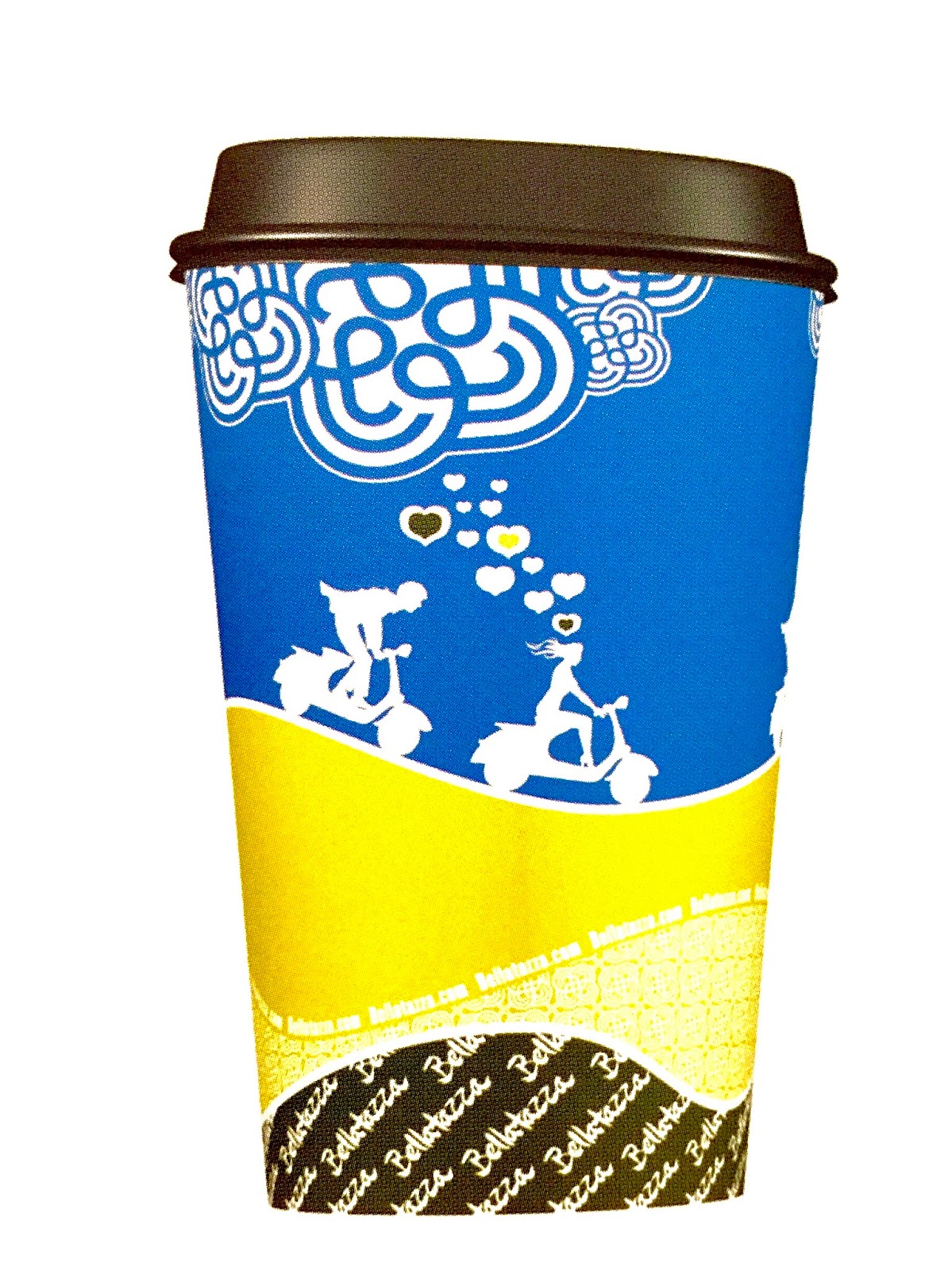
I was looking to buy a large sphere to cover my water bottles and this beautiful packaging appeared.
I just wanted to remember this cool design for reference. I hope you can appreciate the design as I find this design to be very successful and attractive. I wonder if food packaging could be influenced by this design too? Like candies or chocolates?
Showing posts with label Just Design. Show all posts
Saturday, May 2, 2020
Friday, November 15, 2019
Japanese Influence On Design
When I am brain dead and bored, I like to look at other people's designs to get inspired. Here are some designs that makes me go... wow... Hey, I can do this better or maybe I can put it in different applications that no one has thought of. I love challenging myself and I guess that is my hobby. Always thinking and improving things.
These are such a lovely designs on boring canvas bag that makes it expensive looking. It has the influence of Roy Lichtenstein, the NY Pop Artist and techno type design. I believe Coach can use this type of design in their products. Their designs are so boring now -
![]() |
| I love these canvas bags. Can I have more of these designs out there, please? |
| Mural Designs |
| In a office lobby the designs are being applied. |
These are definitely very interesting looking paper cup designs. Why can't more people design like this I can't understand. Please designers out there, be more proactive and take every opportunity to design well and interesting, no matter how boring the product is. Also decision makers that be, please choose better designs and not Safe Boring choices!
![]() |
| Coffee Paper cups |
Thursday, May 30, 2019
Type in Labels
I just love typography. Here are some samples you can do with type and make it so full of character and personality. These are my favorite designs. You could read more here: https://bit.ly/2wAnfat
Sunday, May 18, 2014
Monday, March 24, 2014
The Saskia’s Studio – Tadao Ando
I have always wondered where this concept came from. I finally realized that Tadao Ando has designed the level of the pool to the level of the sea with great succession. I love this idea and it is used in many hotels now especially in Singapore.
The Saskia's Studio is built in Sri Lanka. Here the minimalistic style of Tadao Ando speaks with volume. To me, though concrete walls seem cold and sterile, but there is a sense of continuum when lines leads to another and fall into unexpected space. All well thought out and masterful.
The Saskia's Studio
The Saskia's Studio is built in Sri Lanka. Here the minimalistic style of Tadao Ando speaks with volume. To me, though concrete walls seem cold and sterile, but there is a sense of continuum when lines leads to another and fall into unexpected space. All well thought out and masterful.
The Saskia's Studio
Church Of Light, Osaka – Tadao Ando
For Ando, the Church of Light is an architecture of duality – the dual nature of [co]existence – solid/void, light/dark, stark/serene. The coexisting differences leave the church void of any, and all, ornament creating a pure, unadorned space. The intersection of light and solid raises the occupants awareness of the spiritual and secular within themselves.
Design
Formally, Ando’s Church of the Light is minimalist and reductive of religious paraphernalia to a simple cruciform extrusion, which is often criticized as disturbingly empty, void, and undefined. Although it has been stated to be nothing more than six walls and a roof, there is a whole level of design aesthetic implemented by Ando and his contractors that is misread and unrecognized by the occupants. As a modern, minimalist structure the Church of the Light emits an architectural purity that is found in the details. The reinforced concrete volume is void of any and all ornament that is not part of the construction process. The seams and joints of the concrete are built with precision and care by master Japanese carpenters, along with Ando, that have worked to create an immaculately smooth surface and accurately aligned joints. So much so, that the seams of the concrete formwork align perfectly with the crosses extrusion on the east side of the church.The concrete construction is a reinforcement of Ando’s principal focus on simplicity and minimalist aesthetic; however, the way in which the concrete is poured and formed gives the concrete a luminous quality when exposed to natural light. Ando’s decision to place the cross on the east façade allows for light to pour into the space throughout the early morning and into the day, which has a dematerializing effect on the interior concrete walls transforming the dark volume into an illuminated box. Ando’s approach to light and concrete in the Church of the Light, as well as his other projects, has a surreal effect that perceptually changes material into immaterial, dark into light, light into space.
Construction and Structure
The church has an area of roughly 113 m² about the same size as a small house. The church was planned as an add-on to the wooden chapel and minister's house that already existed at the site. The Church of the Light consists of three 5.9m concrete cubes (5.9m wide x 17.7m long x 5.9m high) penetrated by a wall angled at 15°, dividing the cube into the chapel and the entrance area. One indirectly enters the church by slipping between the two volumes, one that contains the Sunday school and the other that contains the worship hall. The benches, along with the floor boards, are made of re-purposed scaffolding used in the construction.It took more than two years to complete. The delay in completing the work was due to problems in raising the necessary funds. Initially it was feared that it would cost more than the budget and Ando even considered building it without a roof, but the construction firm donated the roof and this became unnecessary.
Trailer Ando documentary from matfrick on Vimeo.
Sources:
Wikiarquitectura
Archdaily
Galinsky
Wikipedia
Tuesday, March 18, 2014
Colour Associations
RED
Red is the color of fire and blood, so it is associated with energy, war, danger, strength, power, determination as well as passion, desire, and love.
Red is a very emotionally intense color. It enhances human metabolism, increases respiration rate, and raises blood pressure. It has very high visibility, which is why stop signs, stoplights, and fire equipment are usually painted red. In heraldry, red is used to indicate courage. It is a color found in many national flags.
Red brings text and images to the foreground. Use it as an accent color to stimulate people to make quick decisions; it is a perfect color for 'Buy Now' or 'Click Here' buttons on Internet banners and websites. In advertising, red is often used to evoke erotic feelings (red lips, red nails, red-light districts, 'Lady in Red', etc). Red is widely used to indicate danger (high voltage signs, traffic lights). This color is also commonly associated with energy, so you can use it when promoting energy drinks, games, cars, items related to sports and high physical activity.
Light red represents joy, sexuality, passion, sensitivity, and love.
Pink signifies romance, love, and friendship. It denotes feminine qualities and passiveness.
Dark red is associated with vigor, willpower, rage, anger, leadership, courage, longing, malice, and wrath.
Brown suggests stability and denotes masculine qualities.
Reddish-brown is associated with harvest and fall.
ORANGE
Orange combines the energy of red and the happiness of yellow. It is associated with joy, sunshine, and the tropics. Orange represents enthusiasm, fascination, happiness, creativity, determination, attraction, success, encouragement, and stimulation.
To the human eye, orange is a very hot color, so it gives the sensation of heat. Nevertheless, orange is not as aggressive as red. Orange increases oxygen supply to the brain, produces an invigorating effect, and stimulates mental activity. It is highly accepted among young people. As a citrus color, orange is associated with healthy food and stimulates appetite. Orange is the color of fall and harvest. In heraldry, orange is symbolic of strength and endurance.
Orange has very high visibility, so you can use it to catch attention and highlight the most important elements of your design. Orange is very effective for promoting food products and toys.
Dark orange can mean deceit and distrust.
Red-orange corresponds to desire, sexual passion, pleasure, domination, aggression, and thirst for action.
Gold evokes the feeling of prestige. The meaning of gold is illumination, wisdom, and wealth. Gold often symbolizes high quality.
YELLOW
Yellow is the color of sunshine. It's associated with joy, happiness, intellect, and energy.
Yellow produces a warming effect, arouses cheerfulness, stimulates mental activity, and generates muscle energy. Yellow is often associated with food. Bright, pure yellow is an attention getter, which is the reason taxicabs are painted this color.
When overused, yellow may have a disturbing effect; it is known that babies cry more in yellow rooms. Yellow is seen before other colors when placed against black; this combination is often used to issue a warning. In heraldry, yellow indicates honor and loyalty.
Use yellow to evoke pleasant, cheerful feelings. Yellow is a great color to promote children's products and items related to leisure. Yellow is very effective for attracting attention, so use it to highlight the most important elements of your design.
Bright yellow can be also represented as an unstable and spontaneous color. Light yellow tends to disappear into white, so it usually needs a darker color added to the hue to balance the reading legibility.
Dull (dingy) yellow represents caution, decay, sickness, and jealousy.
Light yellow is associated with intellect, freshness, and joy.
GREEN
Green is the color of nature. It symbolizes growth, harmony, freshness, and fertility. Green has strong emotional correspondence with safety. Dark green is also commonly associated with money.
Green has great healing power. It is the most restful color for the human eye; it can improve vision. Green suggests stability and endurance. Sometimes green denotes lack of experience; for example, a 'greenhorn' is a novice. In heraldry, green indicates growth and hope. Green, as opposed to red, means safety; it is the color of free passage in road traffic.
Use green to indicate safety when advertising drugs and medical products. Green is directly related to nature, so you can use it to promote 'green' products. Dull, darker green is commonly associated with money, the financial world, banking, and Wall Street.
Dark green is associated with ambition, greed, and jealousy.
Yellow-green can indicate sickness, cowardice, discord, and jealousy.
Aqua is associated with emotional healing and protection.
Olive green is the traditional color of peace.
BLUE
Blue is the color of the sky and sea. It is often associated with depth and stability. It symbolizes trust, loyalty, wisdom, confidence, intelligence, faith, truth, and heaven.
Blue is considered beneficial to the mind and body. It slows human metabolism and produces a calming effect. Blue is strongly associated with tranquility and calmness. In heraldry, blue is used to symbolize piety and sincerity.
Blue promotes products and services related to cleanliness (water purification filters, cleaning liquids, vodka), air and sky (airlines, airports, air conditioners), water and sea (sea voyages, mineral water). As opposed to emotionally warm colors like red, orange, and yellow; blue is linked to consciousness and intellect. Blue suggests precision when promoting high-tech products.
Blue is a masculine color; according to studies, it is highly accepted among males. Dark blue is associated with depth, expertise, and stability; it is a preferred color for corporate America.
Avoid using blue when promoting food and cooking, because blue suppresses appetite. When used together with warm colors like yellow or red, blue can create high-impact, vibrant designs; for example, blue-yellow-red is a perfect color scheme for a superhero.
Light blue is associated with health, healing, tranquility, understanding, and softness.
Dark blue represents knowledge, power, integrity, and seriousness.
PURPLE
Purple combines the stability of blue and the energy of red. Purple is associated with royalty. It symbolizes power, nobility, luxury, and ambition. It conveys wealth and extravagance. Purple is associated with wisdom, dignity, independence, creativity, mystery, and magic.
According to surveys, almost 75 percent of pre-adolescent children prefer purple to all other colors. Purple is a very rare color in nature. Light purple is a good choice for a feminine design. Usage of bright purple an be effective when promoting children's products.
Light purple evokes romantic and nostalgic feelings.
Dark purple evokes gloom and sad feelings. On the hind side, it also promotes elegance and sophistication.
WHITE
White is associated with light, goodness, innocence, purity, and virginity. It is considered to be the color of perfection.
White means safety, purity, and cleanliness. White can represent a successful beginning. In heraldry, white depicts faith and purity.
In advertising, white is associated with coolness and cleanliness because it's the color of snow. White suggests simplicity in high-tech products. White also is an appropriate color for charitable organizations; angels are usually imagined wearing white clothes. White is associated with hospitals, doctors, and sterility, white is also suggest safety when promoting medical products. White is often associated with low weight, low-fat food, and dairy products.
BLACK
Black is associated with power, elegance, formality, death, evil, and mystery.
Black is a mysterious color associated with fear and the unknown (black holes). Black denotes strength and authority; it is considered to be a very formal, elegant, and prestigious color (black tie, black Mercedes). In heraldry, black can also symbolize of grief.
Black gives the feeling of perspective and depth, but a black background diminishes readability. A black suit or dress can make you look thinner. When designing for a gallery of art or photography, you can use a black or gray background to make the other colors stand out. Black contrasts well with bright colors. Combined with red or orange – other very powerful colors – black gives a very aggressive color scheme.
Other Resources on Color:
The Color Wheel Theory
Mixing the Wheel
Red is the color of fire and blood, so it is associated with energy, war, danger, strength, power, determination as well as passion, desire, and love.
Red is a very emotionally intense color. It enhances human metabolism, increases respiration rate, and raises blood pressure. It has very high visibility, which is why stop signs, stoplights, and fire equipment are usually painted red. In heraldry, red is used to indicate courage. It is a color found in many national flags.
Red brings text and images to the foreground. Use it as an accent color to stimulate people to make quick decisions; it is a perfect color for 'Buy Now' or 'Click Here' buttons on Internet banners and websites. In advertising, red is often used to evoke erotic feelings (red lips, red nails, red-light districts, 'Lady in Red', etc). Red is widely used to indicate danger (high voltage signs, traffic lights). This color is also commonly associated with energy, so you can use it when promoting energy drinks, games, cars, items related to sports and high physical activity.
Light red represents joy, sexuality, passion, sensitivity, and love.
Pink signifies romance, love, and friendship. It denotes feminine qualities and passiveness.
Dark red is associated with vigor, willpower, rage, anger, leadership, courage, longing, malice, and wrath.
Brown suggests stability and denotes masculine qualities.
Reddish-brown is associated with harvest and fall.
ORANGE
Orange combines the energy of red and the happiness of yellow. It is associated with joy, sunshine, and the tropics. Orange represents enthusiasm, fascination, happiness, creativity, determination, attraction, success, encouragement, and stimulation.
To the human eye, orange is a very hot color, so it gives the sensation of heat. Nevertheless, orange is not as aggressive as red. Orange increases oxygen supply to the brain, produces an invigorating effect, and stimulates mental activity. It is highly accepted among young people. As a citrus color, orange is associated with healthy food and stimulates appetite. Orange is the color of fall and harvest. In heraldry, orange is symbolic of strength and endurance.
Orange has very high visibility, so you can use it to catch attention and highlight the most important elements of your design. Orange is very effective for promoting food products and toys.
Dark orange can mean deceit and distrust.
Red-orange corresponds to desire, sexual passion, pleasure, domination, aggression, and thirst for action.
Gold evokes the feeling of prestige. The meaning of gold is illumination, wisdom, and wealth. Gold often symbolizes high quality.
YELLOW
Yellow is the color of sunshine. It's associated with joy, happiness, intellect, and energy.
Yellow produces a warming effect, arouses cheerfulness, stimulates mental activity, and generates muscle energy. Yellow is often associated with food. Bright, pure yellow is an attention getter, which is the reason taxicabs are painted this color.
When overused, yellow may have a disturbing effect; it is known that babies cry more in yellow rooms. Yellow is seen before other colors when placed against black; this combination is often used to issue a warning. In heraldry, yellow indicates honor and loyalty.
Use yellow to evoke pleasant, cheerful feelings. Yellow is a great color to promote children's products and items related to leisure. Yellow is very effective for attracting attention, so use it to highlight the most important elements of your design.
Bright yellow can be also represented as an unstable and spontaneous color. Light yellow tends to disappear into white, so it usually needs a darker color added to the hue to balance the reading legibility.
Dull (dingy) yellow represents caution, decay, sickness, and jealousy.
Light yellow is associated with intellect, freshness, and joy.
GREEN
Green is the color of nature. It symbolizes growth, harmony, freshness, and fertility. Green has strong emotional correspondence with safety. Dark green is also commonly associated with money.
Green has great healing power. It is the most restful color for the human eye; it can improve vision. Green suggests stability and endurance. Sometimes green denotes lack of experience; for example, a 'greenhorn' is a novice. In heraldry, green indicates growth and hope. Green, as opposed to red, means safety; it is the color of free passage in road traffic.
Use green to indicate safety when advertising drugs and medical products. Green is directly related to nature, so you can use it to promote 'green' products. Dull, darker green is commonly associated with money, the financial world, banking, and Wall Street.
Dark green is associated with ambition, greed, and jealousy.
Yellow-green can indicate sickness, cowardice, discord, and jealousy.
Aqua is associated with emotional healing and protection.
Olive green is the traditional color of peace.
BLUE
Blue is the color of the sky and sea. It is often associated with depth and stability. It symbolizes trust, loyalty, wisdom, confidence, intelligence, faith, truth, and heaven.
Blue is considered beneficial to the mind and body. It slows human metabolism and produces a calming effect. Blue is strongly associated with tranquility and calmness. In heraldry, blue is used to symbolize piety and sincerity.
Blue promotes products and services related to cleanliness (water purification filters, cleaning liquids, vodka), air and sky (airlines, airports, air conditioners), water and sea (sea voyages, mineral water). As opposed to emotionally warm colors like red, orange, and yellow; blue is linked to consciousness and intellect. Blue suggests precision when promoting high-tech products.
Blue is a masculine color; according to studies, it is highly accepted among males. Dark blue is associated with depth, expertise, and stability; it is a preferred color for corporate America.
Avoid using blue when promoting food and cooking, because blue suppresses appetite. When used together with warm colors like yellow or red, blue can create high-impact, vibrant designs; for example, blue-yellow-red is a perfect color scheme for a superhero.
Light blue is associated with health, healing, tranquility, understanding, and softness.
Dark blue represents knowledge, power, integrity, and seriousness.
PURPLE
Purple combines the stability of blue and the energy of red. Purple is associated with royalty. It symbolizes power, nobility, luxury, and ambition. It conveys wealth and extravagance. Purple is associated with wisdom, dignity, independence, creativity, mystery, and magic.
According to surveys, almost 75 percent of pre-adolescent children prefer purple to all other colors. Purple is a very rare color in nature. Light purple is a good choice for a feminine design. Usage of bright purple an be effective when promoting children's products.
Light purple evokes romantic and nostalgic feelings.
Dark purple evokes gloom and sad feelings. On the hind side, it also promotes elegance and sophistication.
WHITE
White is associated with light, goodness, innocence, purity, and virginity. It is considered to be the color of perfection.
White means safety, purity, and cleanliness. White can represent a successful beginning. In heraldry, white depicts faith and purity.
In advertising, white is associated with coolness and cleanliness because it's the color of snow. White suggests simplicity in high-tech products. White also is an appropriate color for charitable organizations; angels are usually imagined wearing white clothes. White is associated with hospitals, doctors, and sterility, white is also suggest safety when promoting medical products. White is often associated with low weight, low-fat food, and dairy products.
BLACK
Black is associated with power, elegance, formality, death, evil, and mystery.
Black is a mysterious color associated with fear and the unknown (black holes). Black denotes strength and authority; it is considered to be a very formal, elegant, and prestigious color (black tie, black Mercedes). In heraldry, black can also symbolize of grief.
Black gives the feeling of perspective and depth, but a black background diminishes readability. A black suit or dress can make you look thinner. When designing for a gallery of art or photography, you can use a black or gray background to make the other colors stand out. Black contrasts well with bright colors. Combined with red or orange – other very powerful colors – black gives a very aggressive color scheme.
Other Resources on Color:
The Color Wheel Theory
Mixing the Wheel
Friday, December 21, 2012
3D Xmas Cookies _Printed
I think this is super cool to have real 3D cookies in a card. Watch this video.
3D PRINTED CHRISTMAS COOKIES from Ralf Holleis on Vimeo.
Wednesday, December 12, 2012
6 Creative Everyday Things...
... That Shows Form And Function
Moo MicroFibre Slippers: You know how some little kids are like pets? They have no idea of hygiene or organization and it takes a lot out of you to train them. Sometimes it is utterly impossible... so you have to work around them. This natural cleaning slipper is a great creative way that shows form and function. I do wish they make it for adults too... It is cute right?
Mr Tea Infuser: Aweee... he is so adorable in my tea mug. My chubby companion that will keep me warm in cold winter days. There is something in this design which is enchanting and compelling to buy for gifts and to own it. First I think it is the way he sits in the cup, and he has a belly that house my exclusive tea leaves as it oozes the tea fragrance as it infusers. What a pal!
Cotton Swaps Noir: Have you ever seen black cotton swaps? For Noir lovers like myself... this is the ultimate and beyond. Imagine - black decor, minimalistic and stylish in the bathroom vanity. Place this in a simple, Swiss designed glass container and you got the ultimate original look that your guest will talk about and remember.
The Eco-Amp: I own a smart phone that is not loud enough in crowded places. Maybe I am hard on hearing and I do not usually carry a headphone with me all the time. This eco-amplifier would be an emergency solution as it is light weight, flat and easily carried. What wonderful designs and colors to choose from too. Great solution Eco-Amp!
Giant Clip On: I love to have my morning coffee or tea with me when I work. This is a great resource of space saving by clipping your mug to your table. What a great idea! And it is bright enough to catch the attention of not spilling. I love the lime one very much.
Monster Key Caps: Have you ever had so many similar keys that you wish that there was a identifier? I vote for this awesome monster key caps. It is creative and fun that makes your key holder a conversational connector.
Tuesday, December 6, 2011
The Venus Project
The Venus Project advocates an alternative vision for a sustainable new world civilization unlike any social-economic system that has gone before. It calls for a straightforward redesign of a culture, in which the age-old inadequacies of war, poverty, hunger, debt, and unnecessary human suffering are viewed not only as avoidable, but totally unacceptable.
Jacque Fresco: Futurist
Mr. Fresco's background includes industrial design and social engineering, as well as being a forerunner in the field of Human Factors. Mr. Fresco has worked as both designer and inventor in a wide range of fields spanning from biomedical innovations to totally integrated social systems.
The Venus Project reflects the culmination of Jacque Fresco's life work: the integration of the best of science and technology into a comprehensive plan for a new society based on human and environmental concern. It is a global vision of hope for the future of humankind in our technological age.
A major documentary, titled Future By Design, on the life, designs and philosophy of Jacque Fresco in now available. This is produced by Academy Award Nominated and Emmy Winning filmmaker, William Gazecki. The film Zeitgeist Addendum featuring Jacque Fresco and The Venus Project produced by Peter Joseph was recently released. It can be viewed at www.zeitgeistaddendum.com
Jacque Fresco: Futurist
Mr. Fresco's background includes industrial design and social engineering, as well as being a forerunner in the field of Human Factors. Mr. Fresco has worked as both designer and inventor in a wide range of fields spanning from biomedical innovations to totally integrated social systems.
The Venus Project reflects the culmination of Jacque Fresco's life work: the integration of the best of science and technology into a comprehensive plan for a new society based on human and environmental concern. It is a global vision of hope for the future of humankind in our technological age.
A major documentary, titled Future By Design, on the life, designs and philosophy of Jacque Fresco in now available. This is produced by Academy Award Nominated and Emmy Winning filmmaker, William Gazecki. The film Zeitgeist Addendum featuring Jacque Fresco and The Venus Project produced by Peter Joseph was recently released. It can be viewed at www.zeitgeistaddendum.com
Tuesday, November 15, 2011
Friday, November 11, 2011
What is Graphic Design?
It is a way of communicating information in all types of media, in a simplest to the most complex form which attracts the viewer to act.
Tuesday, November 8, 2011
Your Business Card Is Your Power Tool
Lately, the only important "leave behind" seems like a business card to remember you by, and to find out more information about your background on social media sites.
Being at social and networking events, meeting so many people can be challenging. Thank goodness for the various social media sites that you can finally fit a name to a face and get to know people a little more, so that more targeted and meaningful conversations can be held later, through emails and texting.
Business cards can seem trivial at social gatherings, but it really takes out a lot of the guesswork and misconceptions off the picture.
Having a great business card is a must, as it represents who you are. Your business is your brand. It says a lot about you as the first impression counts.
There are many ways to get your business cards noticed. In the end, the goal is to get your prospect to add your business information in their contact list, remember you and use you when they need you.
An effective business card needs to be professionally designed and not cluttered with information that is hard to read. Whatever is not on the card, should be reflected on the website. Never use an on-line template business card that is free. A million people are using the same thing and you are losing your personal brand. You need to be unique and portrayed strongly. Your image matters.
Basic things that should be on the business card:
To add more interest and keep sake to your card, it can be a sticker; a magnet, an offer or a memorable wise saying... something that will make people remember you. For me, it is true that after I have put all the information down in my iPhone, I will dump the cards out... unless it is well designed and of quality, then I will keep them on file.
In this information age especially in business, it is a must to have a dynamite business card and a well designed website to support all your information. Where everything is concerned, these are the two basic things to have, when running a business.
Remember, Good Design Is Good Business.
www.shamikodesign.com
Being at social and networking events, meeting so many people can be challenging. Thank goodness for the various social media sites that you can finally fit a name to a face and get to know people a little more, so that more targeted and meaningful conversations can be held later, through emails and texting.
Business cards can seem trivial at social gatherings, but it really takes out a lot of the guesswork and misconceptions off the picture.
Having a great business card is a must, as it represents who you are. Your business is your brand. It says a lot about you as the first impression counts.
An effective business card needs to be professionally designed and not cluttered with information that is hard to read. Whatever is not on the card, should be reflected on the website. Never use an on-line template business card that is free. A million people are using the same thing and you are losing your personal brand. You need to be unique and portrayed strongly. Your image matters.
Basic things that should be on the business card:
- Logo
- Name
- Title
- Phone/Mobile
- Website
- Brand Feel, Tag line
- Social media address (2-3 listings)
- Address (optional, depends on the business)
To add more interest and keep sake to your card, it can be a sticker; a magnet, an offer or a memorable wise saying... something that will make people remember you. For me, it is true that after I have put all the information down in my iPhone, I will dump the cards out... unless it is well designed and of quality, then I will keep them on file.
In this information age especially in business, it is a must to have a dynamite business card and a well designed website to support all your information. Where everything is concerned, these are the two basic things to have, when running a business.
Remember, Good Design Is Good Business.
www.shamikodesign.com
Sunday, October 30, 2011
Tuesday, October 25, 2011
Thursday, October 13, 2011
Design Philosophy
I cannot understand why a painting should look exactly like a photograph. If it has to be, then there must be elements that are unusual enough to arouse the curiosity.
Wednesday, October 12, 2011
Wednesday, August 17, 2011
The History of Art Movements
Byzantine
A style of the Byzantine Empire and its provinces, c. 330-1450. Appearing mostly in religious mosaics, manuscript illuminations, and panel paintings, it is characterized by rigid, monumental, stylized forms with gold backgrounds.
1000. Romanesque
A European style developed in France in the late eleventh century. Its sculpture is ornamental, stylized and complex. Some Romanesque frescoes survive, painted in a monumental, active manner.
1200. Gothic
A European movement beginning in France. Gothic sculpture emerged c. 1200, Gothic painting later in the thirteenth century. The artworks are characterized by a linear, graceful, elegant style more naturalistic than that which had existed previously in Europe.
1400 - 1600. Renaissance
Meaning "rebirth" in French. Refers to Europe c. 1400-1600. Renaissance art which began in Italy, stressed the forms of classical antiquity, a realistic representation of space based on scientific perspective, and secular subjects. The works of Leonardo, Michelangelo, and Raphael exemplify the balance and harmony of the High Renaissance (c. 1495-1520).
1520 - 1600. Mannerism
A style, c. 1520-1600, that arose in reaction to the harmony and proportion of the High Renaissance. It featured elongated, contorted poses, crowded canvases, and harsh lighting and coloring.
Classicism
Referring to the principles of Greek and Roman art of antiquity with the emphasis on harmony, proportion, balance, and simplicity. In a general sense, it refers to art based on accepted standards of beauty.
Baroque
A movement in European painting in the seventeenth and early eighteenth centuries, characterized by violent movement, strong emotion, and dramatic lighting and coloring. Bernini, Caravaggio and Rubens were among important baroque artists.
Folk Art
Works of a culturally homogeneous people without formal training, generally according to regional traditions and involving crafts.
1700. Rococo
An eighteenth-century European style, originating in France. In reaction to the grandeur and massiveness of the baroque, rococo employed refined, elegant, highly decorative forms. Fragonard worked in this style.
1700 - 1800. Romanticism
A European movement of the late eighteenth to mid nineteenth century. In reaction to neoclassicism, it focused on emotion over reason, and on spontaneous expression. The subject matter was invested with drama and usually painted energetically in brilliant colors. Delacroix, Gericault, Turner, and Blake were Romantic artists.
Barbizon School
An association of French landscape painters, c. 1840-70, who lived in the village of Barbizon and who painted directly from nature. Theodore Rousseau was a leader; Corot and Millet were also associated with the group.
1800. Realism
In a general sense, refers to objective representation. More specifically, a nineteenth century movement, especially in France, that rejected idealized academic styles in favor of everyday subjects. Daumier, Millet, and Courbet were realists.
1800. Naive art
Artwork, usually paintings, characterized by a simplified style, nonscientific perspective, and bold colors. The artists are generally not professionally trained. Henri Rousseau and Grandma Moses worked in this style.
1848. Pre-Raphaelite Brotherhood
A group of English painters formed in 1848. These artists attempted to recapture the style of painting preceding Raphael. They rejected industrialized England and focused on painting from nature, producing detailed, colorful works. Rossetti was a founding member.
1880 - 1900. Neo Classicism
A European style of the late eighteenth and early nineteenth centuries. Its elegant, balanced works revived the order and harmony of ancient Greek and Roman art. David and Canova are examples of neo classicists.
1870. Impressionism
A late-nineteenth-century French school of painting. It focused on transitory visual impressions, often painted directly from nature, with an emphasis on the changing effects of light and color. Monet, Renoir, and Pissarro were important impressionists.
1880. Post Impressionism
A term coined by British art critic Roger Fry to refer to a group of nineteenth-century painters, including Cezanne, Van Gogh, and Gauguin, who were dissatisfied with the limitations of expressionism. It has since been used to refer to various reactions against impressionism, such as fauvism and expressionism.
1880. Pointillism
A method of painting developed by Seurat and Paul Signac in the 1880s. It used dabs of pure color that were intended to mix in the eyes of viewers rather than on the canvas. It is also called divisionism or neo impressionism.
1880 - 1890. Symbolism
A painting movement that flourished in France in the 1880s and 1890s in which subject matter was suggested rather than directly presented. It featured decorative, stylized, and evocative images.
1890. Nabis From the Hebrew word for "prophet."
A group of French painters active in the 1890s who worked in a subjective, sometimes mystical style, stressing flat areas of color and pattern. Bonnard and Vuillard were members.
Ash Can School
Group of American artists active from 1908 to 1918. It included members of The Eight such as Henri and Davies; Hopper was also part of the Ash Can group. Their work featured scenes of urban realism.
1900. Cubism
A revolutionary movement begun by Picasso and Braque in the early twentieth century. It employs an analytic vision based on fragmentation and multiple viewpoints.
1905 - 1008. Fauvism
From the French word fauve , meaning "wild beast ." A style adopted by artists associated with Matisse, c. 1905-08. They painted in a spontaneous manner, using bold colors.
1913. Suprematism
A Russian abstract movement originated by Malevich c. 1913. It was characterized by flat geometric shapes on plain backgrounds and emphasized the spiritual qualities of pure form.
1909 - 1919. Futurism
An Italian movement c. 1909-19. It attempted to integrate the dynamism of the machine age into art. Boccioni was a futurist artist.
1915. Constructivism
A Russian abstract movement founded by Tatlin, Gabo, and Antoine Pevsner, c. 1915. It focused on art for the industrial age. Tatlin believed in art with a utilitarian purpose.
1905 - 1925. Epressionism.
Refers to art that uses emphasis and distortion to communicate emotion. More specifically, it refers to early twentieth century northern European art, especially in Germany c. 1905-25. Artists such as Rouault, Kokoschka, and Schiele
1915 - 1923. Dadaism
A movement, c. 1915-23, that rejected accepted aesthetic standards. It aimed to create anti art and non art, often employing a sense of the absurd.
1900. Art Nouveau
A decorative art movement that emerged in the late nineteenth century. Characterized by dense asymmetrical ornamentation in sinuous forms, it is often symbolic and of an erotic nature. Klimt worked in an art nouveau style.
1920 - 1030. Art Deco
Design style prevalent during the 1920s and 1930s, characterized by a sleek use of straight lines and slender form.
1920. The Eight
A group of American painters who united out of opposition to academic standards in the early twentieth century. Members of the group were Robert Henri, Arthur Davies, Maurice Prendergast, William James Glackens, Ernest Lawson, Everett Shinn, John Sloan, and George Luks.
1920 - 1930. Surrealism
A movement of the 1920s and 1930s that began in France. It explored the unconscious, often using images from dreams. It used spontaneous techniques and featured unexpected juxtapositions of objects. Magritte, Dali, Miro, and Ernst painted surrealist works.
1940. Abstract Expressionism
Movement in painting, originating in New York City in the 1940s. It emphasized spontaneous personal expression, freedom from accepted artistic values, surface qualities of paint, and the act of painting itself. Pollock, de Kooning, Motherwell, and Kline, are important abstract expressionists.
1950. Color Field Painting
A technique in abstract painting developed in the 1950s. It focuses on the lyrical effects of large areas of color, often poured or stained onto the canvas. Newman, Rothko, and Frankenthaler painted in this manner.
1950. Pop Art
An abstract movement in Europe and the United States, begun in the mid-1950s, based on the effects of optical patterns. It used the images and techniques of mass media, advertising, and popular culture, often in an ironic way. Works of Albers, Warhol, Lichtenstein, and Oldenburg exemplify this style.
1950. Minimalism
A movement in American painting and sculpture that originated in the late 1950s. It emphasized pure, reduced forms and strict, systematic compositions.
1960 - 1970. Conceptual Art
A movement of the 1960s and 1970s that emphasized the artistic idea over the art object. It attempted to free art from the confines of the gallery and the pedestal.
1960 - 1970. Photorealism
A figurative movement that emerged in the United States and Britain in the late 1960s and 1970s. The subject matter, usually everyday scenes, is portrayed in an extremely detailed, exacting style. It is also called super realism, especially when referring to sculpture.
A style of the Byzantine Empire and its provinces, c. 330-1450. Appearing mostly in religious mosaics, manuscript illuminations, and panel paintings, it is characterized by rigid, monumental, stylized forms with gold backgrounds.
1000. Romanesque
A European style developed in France in the late eleventh century. Its sculpture is ornamental, stylized and complex. Some Romanesque frescoes survive, painted in a monumental, active manner.
1200. Gothic
A European movement beginning in France. Gothic sculpture emerged c. 1200, Gothic painting later in the thirteenth century. The artworks are characterized by a linear, graceful, elegant style more naturalistic than that which had existed previously in Europe.
1400 - 1600. Renaissance
Meaning "rebirth" in French. Refers to Europe c. 1400-1600. Renaissance art which began in Italy, stressed the forms of classical antiquity, a realistic representation of space based on scientific perspective, and secular subjects. The works of Leonardo, Michelangelo, and Raphael exemplify the balance and harmony of the High Renaissance (c. 1495-1520).
1520 - 1600. Mannerism
A style, c. 1520-1600, that arose in reaction to the harmony and proportion of the High Renaissance. It featured elongated, contorted poses, crowded canvases, and harsh lighting and coloring.
Classicism
Referring to the principles of Greek and Roman art of antiquity with the emphasis on harmony, proportion, balance, and simplicity. In a general sense, it refers to art based on accepted standards of beauty.
Baroque
A movement in European painting in the seventeenth and early eighteenth centuries, characterized by violent movement, strong emotion, and dramatic lighting and coloring. Bernini, Caravaggio and Rubens were among important baroque artists.
Folk Art
Works of a culturally homogeneous people without formal training, generally according to regional traditions and involving crafts.
1700. Rococo
An eighteenth-century European style, originating in France. In reaction to the grandeur and massiveness of the baroque, rococo employed refined, elegant, highly decorative forms. Fragonard worked in this style.
1700 - 1800. Romanticism
A European movement of the late eighteenth to mid nineteenth century. In reaction to neoclassicism, it focused on emotion over reason, and on spontaneous expression. The subject matter was invested with drama and usually painted energetically in brilliant colors. Delacroix, Gericault, Turner, and Blake were Romantic artists.
Barbizon School
An association of French landscape painters, c. 1840-70, who lived in the village of Barbizon and who painted directly from nature. Theodore Rousseau was a leader; Corot and Millet were also associated with the group.
1800. Realism
In a general sense, refers to objective representation. More specifically, a nineteenth century movement, especially in France, that rejected idealized academic styles in favor of everyday subjects. Daumier, Millet, and Courbet were realists.
1800. Naive art
Artwork, usually paintings, characterized by a simplified style, nonscientific perspective, and bold colors. The artists are generally not professionally trained. Henri Rousseau and Grandma Moses worked in this style.
1848. Pre-Raphaelite Brotherhood
A group of English painters formed in 1848. These artists attempted to recapture the style of painting preceding Raphael. They rejected industrialized England and focused on painting from nature, producing detailed, colorful works. Rossetti was a founding member.
1880 - 1900. Neo Classicism
A European style of the late eighteenth and early nineteenth centuries. Its elegant, balanced works revived the order and harmony of ancient Greek and Roman art. David and Canova are examples of neo classicists.
1870. Impressionism
A late-nineteenth-century French school of painting. It focused on transitory visual impressions, often painted directly from nature, with an emphasis on the changing effects of light and color. Monet, Renoir, and Pissarro were important impressionists.
1880. Post Impressionism
A term coined by British art critic Roger Fry to refer to a group of nineteenth-century painters, including Cezanne, Van Gogh, and Gauguin, who were dissatisfied with the limitations of expressionism. It has since been used to refer to various reactions against impressionism, such as fauvism and expressionism.
1880. Pointillism
A method of painting developed by Seurat and Paul Signac in the 1880s. It used dabs of pure color that were intended to mix in the eyes of viewers rather than on the canvas. It is also called divisionism or neo impressionism.
1880 - 1890. Symbolism
A painting movement that flourished in France in the 1880s and 1890s in which subject matter was suggested rather than directly presented. It featured decorative, stylized, and evocative images.
1890. Nabis From the Hebrew word for "prophet."
A group of French painters active in the 1890s who worked in a subjective, sometimes mystical style, stressing flat areas of color and pattern. Bonnard and Vuillard were members.
Ash Can School
Group of American artists active from 1908 to 1918. It included members of The Eight such as Henri and Davies; Hopper was also part of the Ash Can group. Their work featured scenes of urban realism.
1900. Cubism
A revolutionary movement begun by Picasso and Braque in the early twentieth century. It employs an analytic vision based on fragmentation and multiple viewpoints.
1905 - 1008. Fauvism
From the French word fauve , meaning "wild beast ." A style adopted by artists associated with Matisse, c. 1905-08. They painted in a spontaneous manner, using bold colors.
1913. Suprematism
A Russian abstract movement originated by Malevich c. 1913. It was characterized by flat geometric shapes on plain backgrounds and emphasized the spiritual qualities of pure form.
1909 - 1919. Futurism
An Italian movement c. 1909-19. It attempted to integrate the dynamism of the machine age into art. Boccioni was a futurist artist.
1915. Constructivism
A Russian abstract movement founded by Tatlin, Gabo, and Antoine Pevsner, c. 1915. It focused on art for the industrial age. Tatlin believed in art with a utilitarian purpose.
1905 - 1925. Epressionism.
Refers to art that uses emphasis and distortion to communicate emotion. More specifically, it refers to early twentieth century northern European art, especially in Germany c. 1905-25. Artists such as Rouault, Kokoschka, and Schiele
1915 - 1923. Dadaism
A movement, c. 1915-23, that rejected accepted aesthetic standards. It aimed to create anti art and non art, often employing a sense of the absurd.
1900. Art Nouveau
A decorative art movement that emerged in the late nineteenth century. Characterized by dense asymmetrical ornamentation in sinuous forms, it is often symbolic and of an erotic nature. Klimt worked in an art nouveau style.
1920 - 1030. Art Deco
Design style prevalent during the 1920s and 1930s, characterized by a sleek use of straight lines and slender form.
1920. The Eight
A group of American painters who united out of opposition to academic standards in the early twentieth century. Members of the group were Robert Henri, Arthur Davies, Maurice Prendergast, William James Glackens, Ernest Lawson, Everett Shinn, John Sloan, and George Luks.
1920 - 1930. Surrealism
A movement of the 1920s and 1930s that began in France. It explored the unconscious, often using images from dreams. It used spontaneous techniques and featured unexpected juxtapositions of objects. Magritte, Dali, Miro, and Ernst painted surrealist works.
1940. Abstract Expressionism
Movement in painting, originating in New York City in the 1940s. It emphasized spontaneous personal expression, freedom from accepted artistic values, surface qualities of paint, and the act of painting itself. Pollock, de Kooning, Motherwell, and Kline, are important abstract expressionists.
1950. Color Field Painting
A technique in abstract painting developed in the 1950s. It focuses on the lyrical effects of large areas of color, often poured or stained onto the canvas. Newman, Rothko, and Frankenthaler painted in this manner.
1950. Pop Art
An abstract movement in Europe and the United States, begun in the mid-1950s, based on the effects of optical patterns. It used the images and techniques of mass media, advertising, and popular culture, often in an ironic way. Works of Albers, Warhol, Lichtenstein, and Oldenburg exemplify this style.
1950. Minimalism
A movement in American painting and sculpture that originated in the late 1950s. It emphasized pure, reduced forms and strict, systematic compositions.
1960 - 1970. Conceptual Art
A movement of the 1960s and 1970s that emphasized the artistic idea over the art object. It attempted to free art from the confines of the gallery and the pedestal.
1960 - 1970. Photorealism
A figurative movement that emerged in the United States and Britain in the late 1960s and 1970s. The subject matter, usually everyday scenes, is portrayed in an extremely detailed, exacting style. It is also called super realism, especially when referring to sculpture.
Subscribe to:
Posts (Atom)